I tried KDE Plasma
It's not what I think it would be
KDE Plasma is often regarded as one of the most customizable and powerful Desktop Environment and there’s no doubt about it. So in around January, I switched my main desktop to Debian Testing along with KDE Plasma just to get a taste of how it actually feels like.
Took me a while to get this thing actually running and understand everything but well at least I’ve learnt a lot of stuff along the way and now we’re here.
The good
It is pretty much as “advertised”, just an extremely customizable and adaptable (And with that also comes with a cost of well, slightly more bugs) desktop environment. As a more traditional desktop user, KDE’s default workflow works well and I don’t have to tinker too much to get it right, at the same time offering some comfort features hidden in piles of options. I also love KDE’s Widget as they all are deeply customizable and flexible. This means I can make use of my smallish empty space on my second monitor to display informations that are relevant to me.
And of course I have to mention KRunner, sometimes you just want to just run some quick terminal command, calculations, currency conversion, dictionary and spelling lookup, KRunner can do it all out of the box.
You can also browse more KRunner Plugins/Runners and see what goodies are on the shelf.
If you know a bit about python scripting/C++, you can also just make your own plugin to suits your need. (Although there’s not alot of documentation).
Ah, bugs…
Right after the initial installation I was hit with a devastating multi-monitor bug.

Introduced in Plasma 5.26, if you start the plasma session with 2 monitor under X11, all icons across the entire shell will disappear, window title will disappear and the context menu is oversized.
The worst part is probably the oversized context menu and it pretty much just means I can’t right click anywhere.
For a long time I was pretty much stuck with single monitor as Wayland works rather “terribly” on my machine.
However when Plasma 5.27 came around Wayland seems to be much smoother, along with the new multi-monitor refactor I can now comfortably switch to Wayland and finally use my second monitor. (Also my current monitor only works well with limited RGB Range, props to KDE devs for making this easy to switch under Display Settings).
However Wayland also has its own set of issues (Window thumbnail on the panel may not always show, clipboard is a bit wonky etc), and for many Wayland may still not be a viable option, and this rather odd multi-monitor bug might just throws alot of new potential user away from Plasma or even Linux in general.
Note: The bug mentioned above has been fixed on Plasma 5.27.2
Unfortunately there are still more bugs waiting for me, mostly relating to random crashes (Even more so in Wayland, there’s rarely a single day where I don’t have to restart plasmashell), and it doesn’t help that Dr Konqi keeps saying that the crash report is not useful, or doesn’t even pop up at all.
Some of them are packaging issues and are not caused by Plasma itself (Ahem Apper), but nevertheless still hinders the desktop experience.
Sure some will say “Plasma works flawless here” but my experience unfortunately tells me otherwise, and it can get very painful especially if you’re still relatively new to Linux having everything fall down on you.
Now don’t get me wrong, I am not trying to bash against the developer or question the direction plasma is heading. Plasma is complex software and I appreciate those who voluntarily contributes to KDE. I am just here documenting my experience and how one might be easily discouraged from using Plasma/Linux in general, and I sincerely hope most of them will be fixed in Plasma 6.
UX
Another issue with Plasma is that the UX can get well… a bit questionable. (UI however is absolutely fine and consistent, even if the borders are subjective).
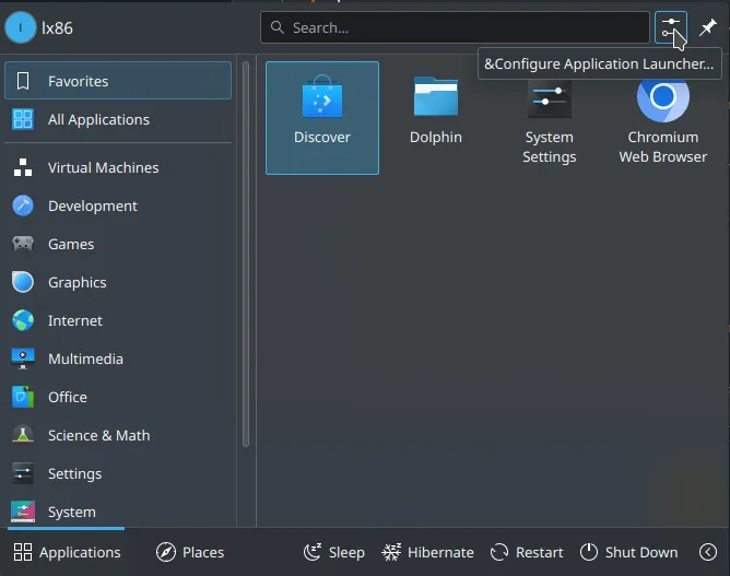
For example if you want to add an application to the Application Launcher (Start menu), the most average computer users would just drag the app from the panel to the Application Launcher.
Nope that doesn’t work. So I tried right clicking the empty space in the launcher, expecting that there will be a context menu that I can add/remove items, but nothing pops up either.
Okay I see a “settings” icon on the top left, given how obviously placed it is surely I can add it from there right?

Nope, it just configures the behavior of the Application Launcher, not the menu itself.
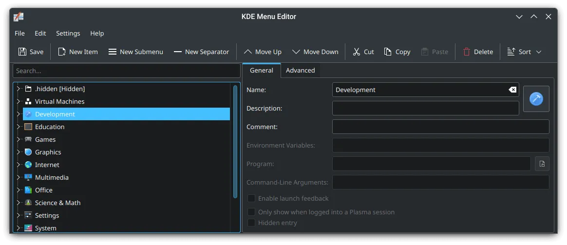
I am really puzzled, so I gave a google search and turns out you need to right click the Application Launcher from the Panel (Taskbar), then you can click “Edit Applications”.
That is just “kinda” hidden? Ideally it should be as follows:
- Drag and Drop
- If drag and drop can’t be implemented due to technicial reasons, right clicking should bring up a way to Add/Edit applications.
- If neither of these are feasible, instead of putting the Settings button (Where the user will most likely only configure this 1 or few times), it’s probably more sensible to just replace it with an Edit Application button instead?
I think Adding and Removing application from the application launcher should be treated differently than “configuring” the application launcher, but rather just a part of the Application Launcher’s functionality that a normal user would encounter at some point.

It also requires the user to save the configuration manually (Good on paper, but in practice it’s not that good with something as simple as editing a start menu).
There’s also no indication on whether the current configuration is *modified or not, so the user would have expected it to be saved automatically, but it doesn’t and you would risk losing the new configuration when the editor crashes, which has happended to me at least 3 times now.
Another thing that I wished Plasma does is the handling hidden files on GUIs. (Very specific I know)
In most cases Plasma just ignores hidden files on the GUI. This can lead to confusion especially with dot-files where, for example, the user are trying to add a .startup.sh as an Autostart item. This would not be shown in the Autostart System Settings at all even if the item is added already, leading to confusions where “I am unable to add my script to startup, it does nothing”.
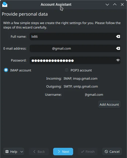
This also goes for other aspects of KDE apps in general. For example when adding an account in KMail (Yes it’s not actively worked on, but given how they are shipped with the standard KDE Installation you would expect it to have better integration with Plasma and work better than other 3rd party applications), you are greeted with this screen.

Clicking the “Next” option will bring you into a loading screen for a split second, then bring you back to this screen with absolutely no indication on what to do, and it turns out you need to click “Add Accounts”.
Ideally, the “Add Account” button should be highlighted, and the Next button should be disabled when it can’t actually do anything. Better yet, get rid of the Add Account all together and do that automatically when clicking Next.
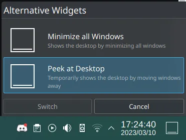
Some options are also just hard to discover, for example the “Show Desktop” widget, to toggle between “Minimize all window” and “Peek at Desktop” you have to switch to an alternative widgets.

These 2 widgets have the exact same apperance but only differs minorly in behavior. A user would try to configure this by right clicking and “Configure Peek at Desktop” only to find that there’s no configuration available other than shortcuts. But given how other widgets also use the Configure Window to configure the behavior it should be the same in this widget as well.
To be clear these UX issues isn’t really a problem for existing Plasma users as they usually know the way around, and in all fairness most of them aren’t located in 50 submenu so it’s very straightforward once you know it, but it sort of creates a barrier for new users who are just trying Plasma out. Sure you can Google it but the user should be able to discover these options by themselves.
With that being said it seems that these UX issues are slowly being tackled on, and newly developed KDE apps are usually pretty good, along with the redesign of Spectacle, moving items to a more sensible group in System Settings it is heading towards a good direction, but there are just many of these issues across different areas, and especially with the amount of apps KDE has, it will probably take a good while for most of it to be resolved.
Overall
Plasma will remain as my primary DE on my main Desktop, it’s a DE where “It works very well… when it does”.
For me there’s a decent amount of crashes and quirks (Yes I will try to report bugs whenever I can) but it’s still a powerful and customizable DE, with the right configuration it can appeal to lots of people.
Obviously if you are new to Linux then Plasma probably won’t be my choice. You’re pretty much always better off with Linux Mint + Cinnamon. Yes they don’t have Wayland, looks dated by default (But theme exists), not as customizable as KDE Plasma, but it’s rock stable and are generally very good just to get your feet wet before going any further.
Or maybe you could also stick with an older version of Plasma and hope these nasty issues don’t chase after you, although they will go out of support soon and that’s not really a viable choice.
I apologize if this post sounds just like me nitpicking KDE Plasma’s weakness, but I really wanted to share on what a normal user may find fustrating, and what could be improved for a more pleasent experience. I do respect all KDE contributors and to get us to where we are today.